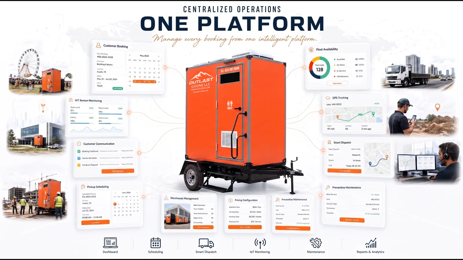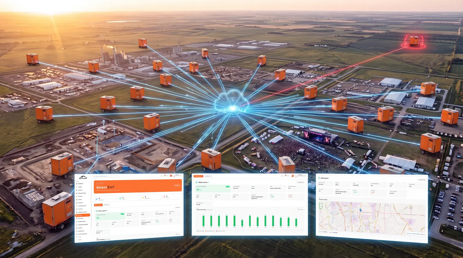
Table of Contents
1. Growing Blind Without Data
An operator with 40 units across three cities faces a decision: buy 10 more units. But which model? And deploy them where?
Without data, the answer is a gut feeling. Maybe the construction sites in Atlanta seem busy. Maybe the A-1P rents more than the C-1P or maybe it just feels that way because the A-1P is newer. Maybe summer is the peak season or maybe it is spring wedding season that actually drives the most bookings.
This is the fourth core problem that holds traditional operations back: no data means no confident growth. Operators who expand based on intuition buy the wrong models, deploy to the wrong cities, and miss seasonal peaks that competitors capture.
Business analytics changes the equation. Not charts for the sake of charts but actionable intelligence that turns booking data, fleet status, maintenance records, and geographic patterns into decisions that grow revenue and cut waste.
2. What Business Analytics Means for Portable Sanitation
Analytics for portable sanitation is not the same as analytics for e-commerce or SaaS. The questions are specific to an industry that moves physical assets across geography, services them in the field, and earns revenue by the hour, day, or month.
A useful analytics system must answer four questions:
| Question | What It Reveals |
|---|---|
| Where is demand? | Which cities and regions generate the most bookings and where is demand underserved |
| What’s working? | Which product models earn the most rental hours and revenue |
| How healthy is my fleet? | Which units need frequent maintenance and which are costing more to maintain than they earn |
| Am I growing? | Revenue trends over time by month, quarter, season, and geography |
Every other metric utilization rate, average rental duration, customer satisfaction scores feeds into one of these four questions. If your analytics dashboard cannot answer all four, it is giving you data without giving you direction.
3. The Analytics Dashboard

The GIG1 FLEET MANAGEMENT PLATFORM analytics dashboard is designed as a single screen where operators see the health of their entire operation at a glance.
Summary Cards
At the top, two headline metrics set the context:
- Total Bookings the number of bookings within the selected time range, providing an immediate pulse on business activity
- Number of Cities how many cities your operation is active in, tracking geographic reach
Time Range Controls
Every chart and metric on the dashboard responds to time filtering:
- Custom date range select specific start and end dates for precise analysis
- Quick filters predefined options like Last 12 Months, Last 30 Days, or Last 7 Days for fast switching
- Export download any view to Excel or CSV format for offline analysis, team reporting, or financial records
This flexibility matters because portable sanitation demand is cyclical. Comparing June to December reveals seasonal patterns. Comparing Q1 year-over-year reveals growth trends. A dashboard locked to “all time” hides the patterns that drive smart decisions.
4. Geographic Demand Analysis
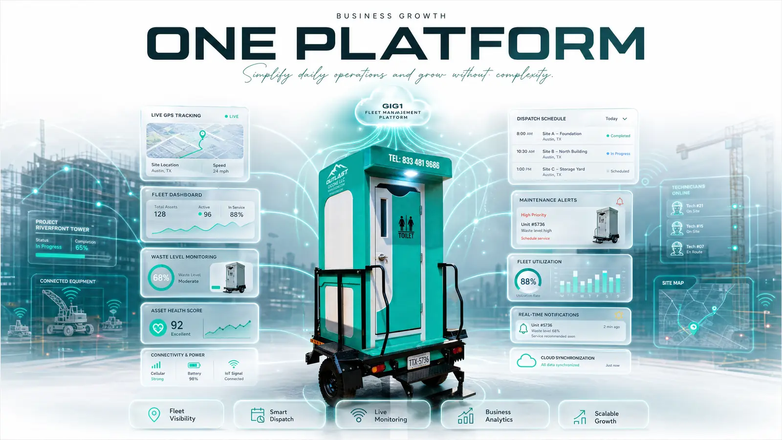
Geography is the first lever for growth. Operators who know where demand concentrates can deploy fleet strategically instead of spreading units thin across low-performing markets.
The GIG1 FLEET MANAGEMENT PLATFORM dashboard provides two geographic views:
Bookings by City Bar Chart
A side-by-side comparison of booking volumes across every city where you operate. At a glance, you can see that Jacksonville generates 3× the bookings of Savannah or that a newly entered market like Nashville is ramping faster than expected.
Top Cities Leaderboard
A ranked list of cities sorted by booking volume, combined with customer satisfaction ratings. This dual metric is critical: a city with high bookings but low satisfaction signals service quality issues. A city with moderate bookings but high satisfaction signals untapped potential customers love the service, but awareness or inventory may be limiting growth.
How to use geographic data:
- High bookings + high satisfaction → invest more units, this market is proven
- High bookings + low satisfaction → fix service quality before adding inventory
- Low bookings + high satisfaction → increase marketing and inventory the product-market fit is there
- Low bookings + low satisfaction → investigate root cause before committing more resources
For operators currently covering Georgia, Florida, South Carolina, Alabama, and Tennessee, this city-level analysis reveals exactly where the next 10 units should go backed by data, not guesswork.
5. Product & Fleet Performance
Not all units earn equally. Analytics reveals which models drive revenue and which sit idle and that difference should shape every purchasing decision.
Top Products by Rental Hours
A ranked view of which models accumulate the most rented hours. For example, the Premium Mobile Oasis™ – Model A-1P might lead with 1,257 rental hours indicating strong demand for premium long-term rentals at construction sites and events. Meanwhile, the C-1P Professional Flush Portable Restroom might show high unit count but lower hours per unit suggesting it serves shorter, high-turnover events.
Top Models Most Rented
Filterable by year or month, this view shows which models customers choose most frequently. Seasonal filtering matters: the Premium Mobile Oasis™ – Model AA-1P may dominate summer festival season, while the Pearl Mobile Oasis B-1P peaks during corporate event months in spring and fall.
Product Status Ratio Pie Chart

A real-time breakdown of your entire fleet’s status:
- Actively rented units generating revenue right now
- In maintenance units temporarily unavailable
- Ready / Available units sitting idle in warehouses
This single chart reveals your fleet utilization rate the percentage of your fleet that is generating revenue at any given moment. The formula is straightforward:
Utilization Rate = Rented Hours ÷ Total Available Hours
An operator with 50 units and a 60% utilization rate has 20 units idle at any time. If analytics shows those idle units are concentrated in one city while another city has a waitlist the solution is redistribution, not purchasing more inventory.
Model-by-model profitability comparison:
| Segment | Models | What Analytics Reveals |
|---|---|---|
| Premium | Premium Mobile Oasis™ – Model AA-1P, Model A-1P | Highest revenue per unit, longer rental durations, seasonal peaks at festivals and construction |
| Design | Flare Mobile Oasis A-1P | Event-driven demand, shorter rental periods, high visibility appeal |
| Luxury | Pearl Mobile Oasis B-1P | Corporate and upscale event niche, moderate volume, premium pricing potential |
| Professional | C-1P Professional Flush Portable Restroom | High-volume, high-turnover, emergency and construction demand |
6. Maintenance Analytics
Every hour a unit spends in maintenance is an hour it is not earning revenue. Maintenance analytics turns repair data into fleet health intelligence.
Maintenance Count by Product
Track how many maintenance sessions each product model requires over any time period. A unit that needs servicing every two weeks costs more in technician time, parts, and lost rental days than a unit serviced monthly.
What high maintenance frequency signals:
- Aging unit approaching end of service life, replacement may be more cost-effective than continued repair
- Usage pattern mismatch a premium unit deployed to high-traffic construction sites may degrade faster than one at corporate events
- Environmental factors units in extreme heat or cold regions may need more frequent anti-freeze maintenance or AC servicing
Maintenance cost vs. revenue per unit:
The most powerful maintenance metric is the ratio of what a unit costs to maintain versus what it earns. When maintenance costs approach 30–40% of a unit’s rental revenue, it is time to evaluate replacement and analytics gives you that number automatically instead of discovering it during year-end accounting.
This data feeds directly from the maintenance management module, where every service job, technician dispatch, and repair record is logged.
7. Strategic Decisions from Data
Analytics is not a passive reporting tool it is a decision engine. Here are five strategic decisions that data makes possible:
1. Expand Smart
Use the Bookings by City chart to identify markets where demand exceeds supply. Invest new units in cities with high booking volume and high customer satisfaction rather than guessing which markets will grow.
2. Optimize Inventory
Use the Product Status Ratio to identify idle fleet. If 30% of your units are consistently available (not rented), either redistribute them to higher-demand cities or adjust pricing to stimulate demand.
3. Improve Service Quality
The Top Cities leaderboard pairs booking volume with satisfaction ratings. Cities with declining satisfaction scores need attention whether that means faster maintenance response, better delivery logistics, or upgraded units.
4. Right-Size Your Fleet Mix
Before purchasing new units, compare model profitability. If the Premium Mobile Oasis™ – Model A-1P generates 2× the revenue per unit compared to basic models, your next purchase should skew premium even if the upfront cost is higher.
5. Plan for Seasonality
Historical booking data reveals demand patterns month by month. Operators who see a consistent 40% booking increase from May through September can prepare: pre-position units, schedule maintenance in April, and adjust pricing for peak season.
8. How Analytics Connects to Every Module
The analytics dashboard does not generate data on its own. It aggregates intelligence from every other module in the smart restroom management platform:
| Source Module | Data Fed to Analytics | Insight Produced |
|---|---|---|
| Asset Tracking | Unit registry, location, condition, warehouse assignment | Fleet size, geographic distribution, asset age |
| IoT Monitoring | Sensor readings, alert frequency, usage patterns | Usage intensity per unit, environmental stress indicators |
| Maintenance | Service jobs, technician time, parts used, repair frequency | Maintenance cost per unit, fleet health score |
| Booking | Rental duration, revenue, customer satisfaction, city demand | Revenue per model, geographic demand, utilization rate |
This is the compounding advantage of an integrated platform. Every booking creates a revenue data point. Every IoT sensor reading creates a usage data point. Every maintenance job creates a cost data point. Analytics connects them all transforming isolated records into a complete picture of business performance.
When the next question becomes “where should we grow?” the answer is already on your dashboard.
9. FAQ
What analytics should portable restroom operators track?
Four key areas: geographic demand (which cities need more units), product performance (which models earn the most rental hours and revenue), fleet health (maintenance frequency and costs per unit), and revenue trends (growth patterns by time period and location).
How does geographic demand analysis help fleet expansion?
By showing which cities have high booking volume paired with high customer satisfaction, operators can invest in proven markets instead of guessing. Cities with high demand but low satisfaction signal service issues to fix before expanding.
What is fleet utilization rate and why does it matter?
Fleet utilization rate is rented hours divided by total available hours. It shows what percentage of your fleet is generating revenue at any given time. A low utilization rate means units are sitting idle either in the wrong location, priced too high, or in excess of local demand.
Can I export analytics data for external reporting?
Yes. The GIG1 FLEET MANAGEMENT PLATFORM analytics dashboard supports export to Excel and CSV formats for any selected time range, enabling operators to create custom reports, share data with stakeholders, or integrate with external accounting systems.
How does maintenance data connect to business analytics?
Every maintenance job logged in the system including technician time, parts used, and repair type feeds into the analytics dashboard. This allows operators to calculate maintenance cost per unit, compare it against revenue, and identify units that cost more to maintain than they earn.